February 9, 2022 by Stonewave team
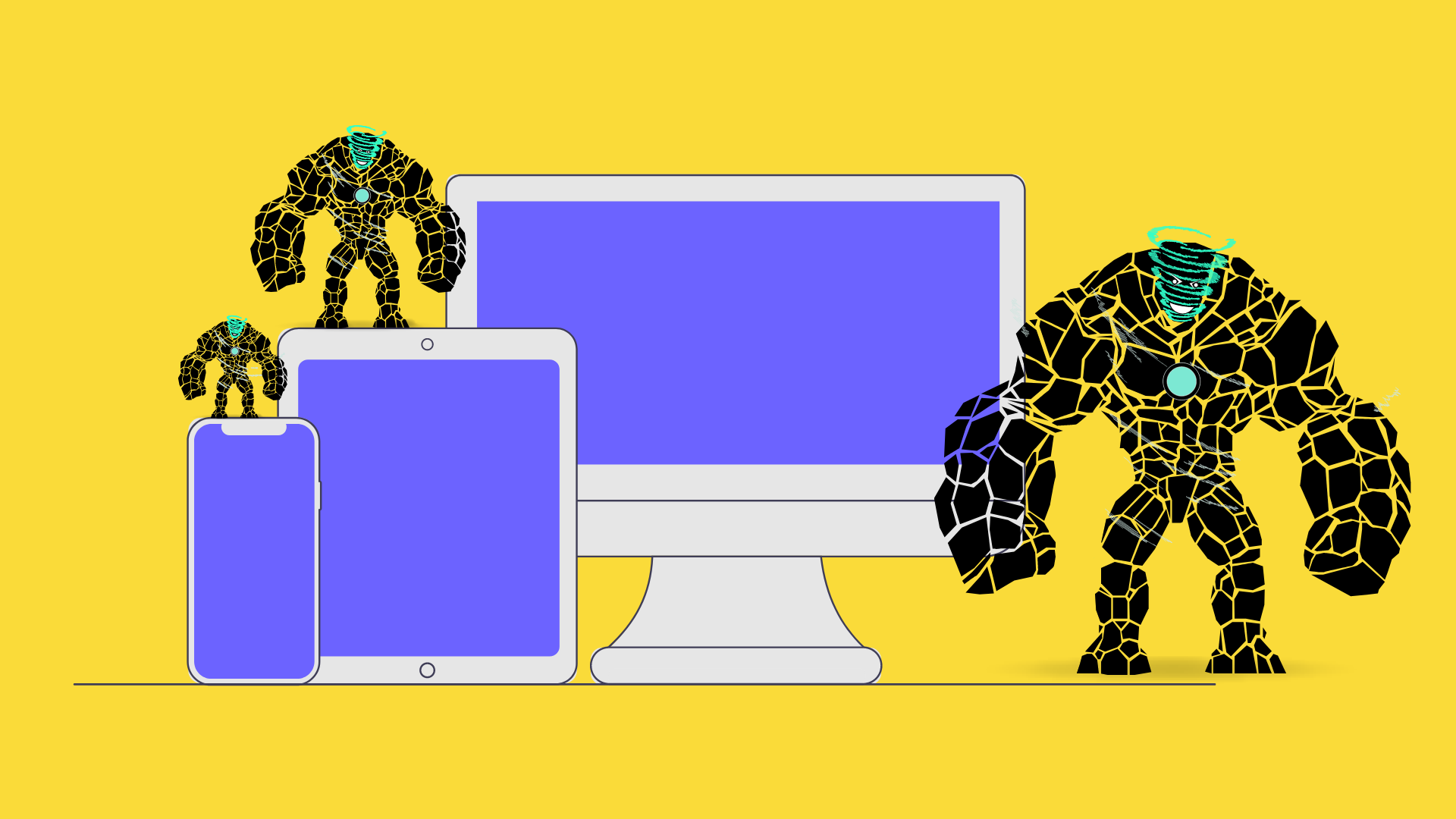
When using the term “responsive design” for a webpage, we are referring to its ability to dynamically adjust its contents position and size based on the screen it’s being viewed on at the time. This offers an equally satisfactory user experience both on desktop and mobile devices.
Over the past fews years, due to the increased use of the internet, more companies are interested in investing money for the development of a website with modern design in order to attract more customers/users on desktop computers, laptops, tablets and, most of all, mobile phones.
The best option for a business is to approach the development of its website by designing the mobile version first. This is the Mobile Theme. In this case, the goal is to design the layout for mobile screens and then transfer/adjust the overall user experience for laptops and desktop computers.
The development process should be quantifiable. The initial design must be simple and clean, using only the basic elements that the company needs. This way, the impact of future additions can be easily monitored, whether it is negative or positive.
In conclusion, the Mobile Theme and Responsive Design are two elements that constitute the new reality of modern web design and development.
If you want to create a website or an application and you want it to combine responsive design and mobile theme, contact us at 2310221500 or [email protected].
